TL;DR
- This blog is for job seekers, students, and professionals creating or updating their resumes, especially those who want to improve their CV design using the right resume colours and resume color combinations.
- Color Can Help Your Resume Stand Out: Using subtle and professional colors can make your resume more visually appealing, highlight key sections, and help recruiters quickly scan important information.
- Choose Colors Based on Your Industry: Creative industries often welcome colorful resumes, while traditional fields like law, accounting, and medicine typically prefer simpler and more conservative color choices.
- Use Color Strategically and Maintain Readability: Stick to one or two colors, ensure strong contrast, and keep the body text in black or dark gray so your resume remains easy to read both digitally and in print.
- Best Resume Color Ideas: Professional color schemes like black and white, navy blue and white, dark gray with soft blue, black with gold accents, and white with teal or green highlights can enhance your resume while maintaining a polished and professional appearance.
Introduction
Using color strategically can help your resume attract a recruiter's attention and stand out among other applications. However, a colorful resume is not always the best choice for every situation. Here, we provide a guide that explains how and when to use colors on your resume and with the help of illustrative examples.
Resume is considered to be a first impression to a potential employer. When trying to identify the right candidate, recruiters usually have a few seconds to see the CV, and then they can make a decision to either read further or move to the next applicant. Because recruiters have limited time, the layout and presentation of your resume play an important role in attracting attention and making your application memorable.
Although content is the most important part of any resume, visual elements such as formatting, typography, and color can make it easier to read and appear more professional. The strategic use of resume colours is one of the design elements that a large number of job seekers do not take into consideration when seeking employment. When used correctly, color can guide the reader's attention, emphasize key sections, and give the resume a modern, sleek appearance.
But there must be balance when it comes to selecting the appropriate resume color combinations. Too much color can make a resume look unprofessional whereas a lack of color would render a resume look dull or boring. It is choosing a few complementary colors that do not make your resume distracting but add value to it.
Know More
- Resume Format for Freshers: Best, Simple Examples for Jobs
- 60 Soft Skills for Resumes
- Student Resume Examples & Template: A Complete Guide for Students
Should Resumes Have Color?
Yes, color may be an advantage in most instances to your resume. Subtle color can be used to make your resume shine among the rest of the applications and make your document more appealing and structured.
Nevertheless, one should take color sparingly. Excessively colorful resumes can present an unprofessional look and can distract the actual content particularly when it impacts on the readability. Overuse of color may also create the impression that the design is being used to balance out the lack of qualifications.
Ultimately, the issue of adding color to your resume is highly dependent on the industry and job you are applying to. As an illustration, the creative industries tend to embrace visually appealing resumes, whereas the more conservative industries tend to embrace less artistic designs.
Color in Creative Industries
When you are not sure as to whether to use color in your resume or not, then think about the industry that you are applying in. Color can enhance your visibility in most creative and media-related applications and make your application more interesting. Such careers can be as follows:
- Graphic designer
- Marketing professional
- Web developer
- Illustrator
- Advertising professional
- Makeup artist
- Interior designer
- Fashion designer
- Animator
- Photographer
Tip:
It is also advisable always to have a colored and black-and-white copy of your resume. This gives you an opportunity to tailor your application to the preferences of different companies and apply to a broader selection of opportunities.
Color in Formal Industries
In case you want to work in a traditional or conservative company, using bright or overly bold colors on your resume is not the best option. In such disciplines, very colorful resumes can seem distractive or unprofessional.
That being said, subtle and darker colours in the resume e.g. navy blue, burgundy or dark green on an otherwise plain and simple resume template is usually fine and can even bring a certain touch of style without undermining the professionalism of the resume.
Industries where bright resume color combos are usually not recommended:
- Law
- Politics
- Accounting
- Academia
- Medicine
- Engineering
- Construction
- Real estate
- Administration
Making wrong decisions in the selection of colors on your resume occasionally may work against you in securing an interview. This is why it is crucial to use the resume colours effectively, which correspond to the demands of your professional sector and still have a professional look.
What Colors Represent on Your Resume
A correct choice of resume colours is not simply a question of taste, but it also conveys certain hidden messages related to your personality and professional characteristics. Diverse colors have varied emotions and impressions, which may impact the perception of hiring managers to your application.
Red
The color red has been linked to activity and vigor. Most people often use it as a call to action color and it can be used to attract attention to major aspects of your resume. Red can be used wisely to create a color combination with a resume and motivate the employer to pay attention to critical areas and take the initiative to respond.
Orange
Orange is a bright and eye-catching colour which conveys creativity, enthusiasm and confidence. Employers can notice by using orange accents in your resume colours that you are an innovator who takes risks and projects a bold image.
Yellow
The color yellow is very vivid and optimistic in nature and gives an impression of fun and vitality. Such a subtle use of yellow, as one of the resume colors, can be used to produce optimism and friendliness, ensuring that your resume produces a happy impression on the hiring managers.
Green
Green can be associated with growth, balance and stability. Green on your resume may help convey a feeling of movement and trustworthiness and the effect of creating a relaxing and easy-going atmosphere to the employers looking through your resume.
Blue
Blue is one of the most commonly used resume colors because it represents trust, professionalism, and reliability. Blue is a safe and reasonable color to use in the branding of many companies and in general leaves a good impression.
Purple
Purple implies ingenuity, culture and opulence. When applied in the background of a resume in combination of colors, it might give a classy and unique appearance to your resume and it also makes it seem original.
Pink
Pink symbolizes creativity, playfulness and personality. It is possible to make your resume look active and communicative with the help of little pink touches, especially in the creative world where original design is valued.
Black
The most conservative color of resume is black. It is a representation of a professional, powerful and elegant image. Most job seekers use black as the text color of choice since it is the most readable and is formal.
Make Sure Your Resume Is Easy to Read
A resume that is not easy to read by the recruiters will not be efficient. Regardless of the resume colours or resume color combinations you use, it should be readability first.
A resume must be well designed so that it can be quickly scanned. Depending on the recruiter, an overview of every application can take them a few seconds, thus your color preferences should be used to arrange information instead of complicating it.
Ensure that the color choices that you make are well contrasting. When you are having a light background, darker colors should be used on headings and accents. Your resume text should be black or dark gray in most instances to make it as readable as possible.
It is also worth considering the way your resume will look after it is printed out. Certain light tones like yellow pale are not guaranteed to print well hence leading to loss of important information in a printed version. The combination of colors used in your resume must be clear and high contrast to make your resume to be more professional and easily readable on the digital and print copies.
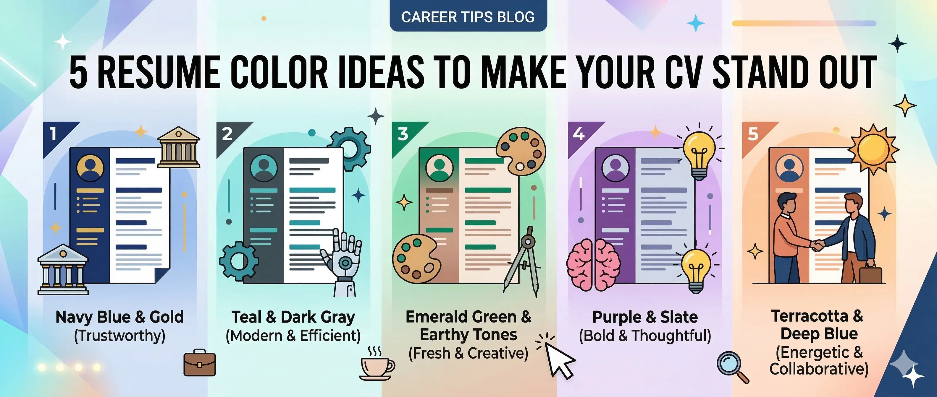
5 Resume Color Ideas to Make Your CV Stand Out
The correct resume colours can also change a boring CV into a well-groomed and impressive paper. The color scheme should also be well chosen because it enhances attractiveness besides simplifying the task of the recruiters to go through your details. Five professional color combinations of resumes that strike the right balance between style and readability are given below and makes your resume professional.
1. Classic Black and White
The most conventional and accepted type of resume is the black-and-white one and is used in all industries. As straightforward as it might seem, it can be an immensely effective tool in combination with a solid formatting and neat typography.
Why It Works:
Black and white resumes are timeless and professional. They eliminate unnecessary distractions and keep the recruiter's focus on your qualifications and achievements.
Benefits include:
- Maximum readability
- Compatibility with Applicant Tracking Systems
- Professional appearance suitable for nearly all industries
- Easy printing and digital viewing
2. Navy Blue and White
One of the commonest colours of resumes is navy blue as it conveys a sense of professionalism, reliability and trust. It gives a personality to your CV but it still looks formal.
3. Dark Gray and Soft Blue
When you are in need of having a modern but professional appearance on your resume, dark gray with soft blue makes a very good combination. This combination of colors makes a little modern design but does not seem too decorative.
Dark gray is a milder option of black with a good readability rate. Soft blue brings in an element of color which is contemporary and innocent.
This minute application of the resume colours is also useful in directing the recruiter attention and also improves the overall design of the document.
This resume color combination is particularly suitable for professionals in:
- Technology
- Product management
- Startup companies
- Digital marketing
It demonstrates professionalism while reflecting awareness of modern design trends.
4. Black with Gold or Mustard Accents
To make the resumes of the job seekers appear elegant and unique, they can use black combined with gold or mustard accents to give the appearance of sophistication.
Mustard and gold colors are creative, confident and refined. They are not overused when displayed and still help to emphasize key areas without cluttering the resume design.
Black is typically used as the main text color, and one can accentuate it with gold or mustard:
- Section headings
- Bullet icons
- Divider lines between sections
5. White with Teal or Green Highlights
Teal and green underline works like freshness and energy to a resume. On the one hand, when used in a reasonable way, they produce a contemporary and visually stimulating design without being too bold.
Color Green is widely attributed to growth, balance, and innovation, whereas teal green has a colorful and professional touch to it. This color combination creates a modern and visually appealing resume design and creative as well as progressive.
This resume style is especially effective for professionals working in:
- Creative roles
- Environmental or sustainability sectors
- Technology startups
- UX/UI design
- Social media and digital marketing
These resume colours are useful to create the picture of the modern, innovative world that would fit the creative and tech-driven sectors.
Resume Colors to Avoid
Although the appropriate resume colours can enhance the general appearance of your CV, there are some colour options that cause a bad effect on your professional image. Incorrect color combinations on your resume may make it difficult to read or it may make it look unprofessional. The following are some of the color selections to avoid.
Neon Colors
The bright neon color may be too much and hard to read. These colors are not always appropriate in the professional documents and can distract the recruiters, who are not supposed to pay so much attention to your qualification.
Too Many Colors
In a single resume, the design may appear unorganized when too many colors are used. Rather, use no more than one or two primary colours of resumes to keep it clean and professional.
Low-Contrast Colors
Low contrast color combinations can make reading difficult, i.e. light gray text on white background or pastel text on light backgrounds. The recruiters must be at a position to read through your resume easily without undue eye strain.
Overly Decorative Designs
Color may be a good idea to use in your resume, but with too much design, it could distract the focus to your experience and competencies. The aim of the resume color combinations is to help the content, not to dominate the content. Be more than clear and professional in designing your resume.
Create Your Perfect Resume Today with Elevizo
Build a beautifully designed, ATS-friendly resume in minutes.
Get Started NowConclusion
When selecting the appropriate resume colours, a resume is much more appealing to the eye and also allows the recruiters to selectively scroll through your details. Resume design color combination when used strategically can lead to a professional and memorable color combination that will show off your qualifications without overpowering it.
It is about the balance, whether you like the classical simplicity of black and white or the new form of elegance of the navy blue, teal or mustard accents. A resume should be well-designed with good content and good presentation.
By choosing colors that match your industry, maintaining strong readability, and using color strategically, you can create a resume that stands out and improves your chances of securing an interview.